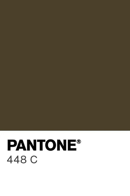
There is a particular shade of dark brown, technically “opaque couché,” though nobody has ever called it that in casual conversation, that the Australian government, in consultation with market researchers, designated as the world’s ugliest color. They slapped it on cigarette packaging to make smoking less appealing. Pantone 448 C. A color so aggressively unattractive that it was weaponized for public health.
And honestly? I think we’ve been too hasty.
Let me make the case that Pantone 448 C is not just underappreciated, it’s underdeployed. We’ve barely scratched the surface of what a color this universally repulsive can accomplish.
Behavioral Nudging at Scale
If a color can discourage people from buying cigarettes, why stop there? Paint it on single-use plastic bags. Slather it across the packaging of ultra-processed foods that list “modified starch” as the second ingredient. Use it on the fine print section of predatory loan agreements, not to hide the text, but to make the entire document feel as unsettling as the terms actually are. The Australians handed us a tool of extraordinary soft power, and we’re using it on exactly one product category.
Urban Planning and Traffic Management
Every city has that one intersection where drivers routinely ignore the no-parking signs. You know the spot: it’s always a delivery van parked sideways, hazards blinking with the quiet confidence of someone who has decided the rules are for other people. Now imagine painting the curb in Pantone 448 C. Not a fine. Not a tow truck. Just an overwhelming sense that parking here was a mistake on an almost spiritual level. The color doesn’t punish, it discourages at the subconscious level. That’s far more elegant than a boot on your wheel.
Corporate Applications
There’s an argument to be made for using 448 C as the default background color for internal emails sent after 6 PM. Not blocked (that would be draconian), just rendered in a shade that makes your brain whisper, “Perhaps this could have been a Slack message. Or nothing at all.” Companies spend millions on wellness programs. This costs a hex code change.
Similarly, I’d propose it as the mandatory color for all “Reply All” buttons in email clients with more than ten recipients. Not removed. Just 448 C. A gentle, aesthetic deterrent against the most avoidable category of organizational chaos.
The Fashion Contrarian Play
Here is where it gets interesting. Fashion has a long history of rehabilitating the aesthetically condemned. Cargo pants came back. So did Crocs. The moment a sufficiently credible designer drops a Pantone 448 C collection at Milan (structured blazers, matte leather accessories, the whole thing framed as “earth-forward minimalism”) the rehabilitation arc begins. Give it eighteen months and there will be a waiting list. The color isn’t ugly; it was just ahead of its time in a way that required institutional rejection before cultural acceptance. That’s basically the story of every interesting thing.
A Philosophical Observation
What strikes me about 448 C is that its designation as the “ugliest color” was not an aesthetic judgment in the traditional sense. It was a market research finding. It’s the color people dislike the most when applied to a product they’re supposed to desire. That’s a very specific kind of ugliness. It’s not that the color offends the eye. It’s that it drains objects of aspiration. It makes things look like they’ve given up on themselves.
Which, if you think about it, makes it the most honest color in the Pantone catalog. Most colors are trying to sell you something. 448 C just sits there, indifferent to your opinion, radiating the energy of a Tuesday afternoon in November.
There’s something admirable about that.

